About the company
Roman's Scarlet Sail is an online shop that specializes in Ukrainian handmade goods. The shop opened in 2012 and gained popularity because of its handmade and unique items. Unfortunately, the shop closed in 2022 because of the war in Ukraine. In 2022, the business owners moved to Canada and decided to continue to support skilled Ukrainian craftspeople but go international with their shop. The client has also wanted a brand refresh and an extended set of brand guidelines to support the vision and objectives of the company.
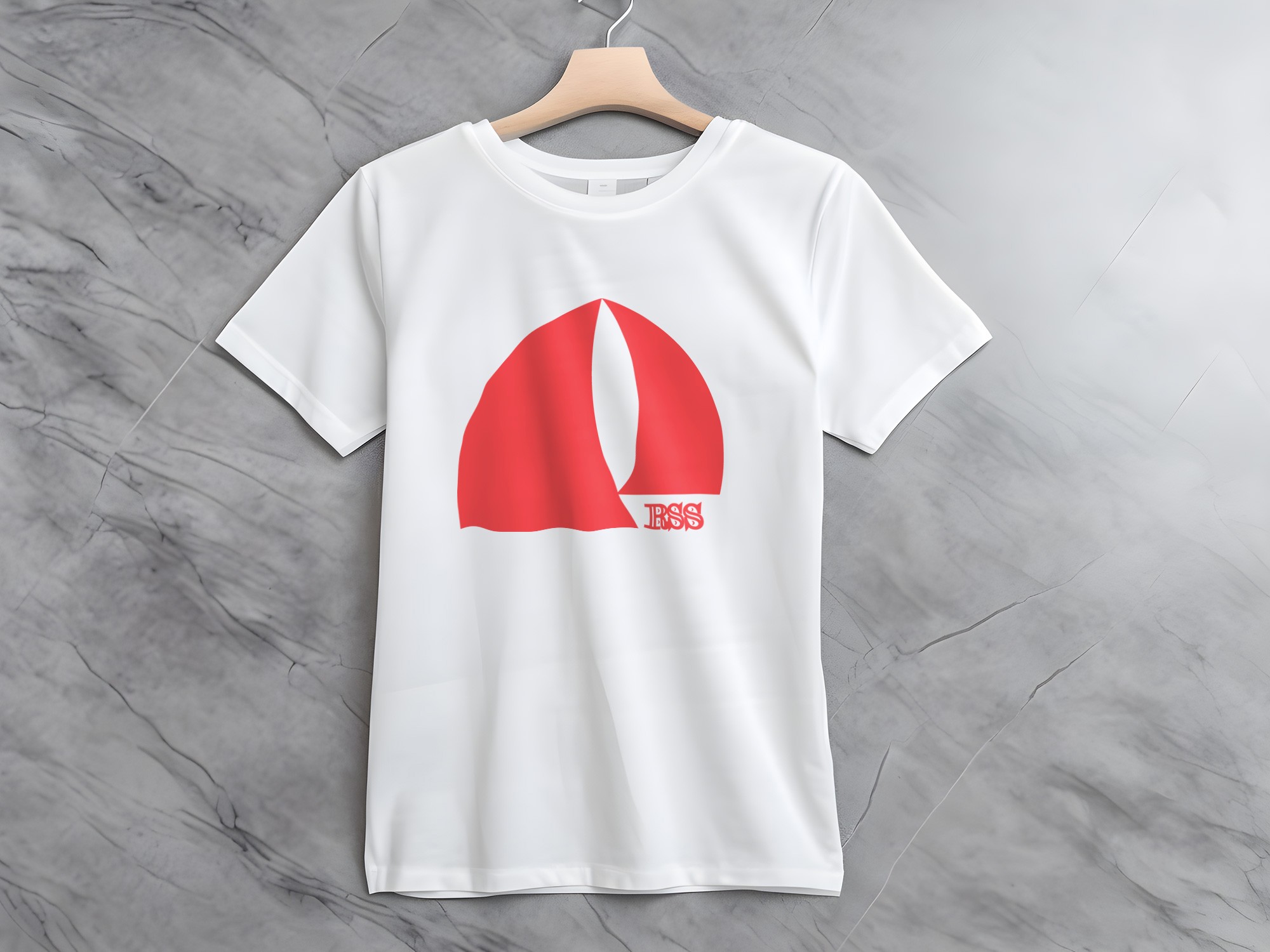
Polishing the logo
Roman's Scarlet Sail needed a redesign of the logo since the original version featured asymmetrical sails and had no emblem that was text-free. I presented the client with three options of emblems after sketching a bunch ideas. The first featured three sails of different size and color, the second featured two curved sails that resembled a crescent moon, and the third featured sails of different sizes facing opposite each other. Each design attempted to capture the essence of the brand while maintaining balance and readability.

My client and I both approved of the final emblem design, which was the best to represent the sails and looked most pleasing among all. I further thought of placing the 'RSS' text emblem on the small corner area at the bottom right, thus creating a harmonized and symmetrical design. This addition created a clean, minimalist logo that was both sensible and elegant.

The client loved it in the end.
The brand now features two logos that work together: one is the sail emblem, and the other is the 'RSS' text logo. Additionally, there’s a lockup combining both elements for a unified visual identity.

Let's dive into the brand assets I created for Roman's Scarlet Sail:
Brand Assets
Alright, let’s talk brand assets! After hours of research and experimenting with countless ideas, I’ve narrowed it down to the best ones. I’m excited to finally share these with you—they bring the brand to life and tie everything together visually.
Sails
The first set of brand assets focuses on the sails, with two different variations. One design features three sails flowing together, creating a sense of movement, while the other highlights a single sail taken straight from the emblem. These elements can be used in titles and other brand materials to reinforce the identity and add a unique visual touch.

Strings
Because Roman's Scarlet Sail is a store that sells handmade products that are knitted it made a lot of sense to make strings as one of the brand assets to put on the marketing material. They are now used for all of the brand's marketing material, which is social media posts, banners and ads. You can also see it used on the background of banners where I show you the brand logos and assets.

Social Media Posts
Roman's Scarlet Sail also needed social media content, so I designed a set of post templates for them. These templates incorporate the string brand asset I mentioned earlier, wrapping around the text to create a cohesive, handcrafted feel. To keep things versatile, I created both black and white versions, ensuring they work across different marketing needs. Here’s a look at them!

Banner
Roman's Scarlet Sail also needed a banner for their Etsy and eBay stores. I designed one that features their emblem, string brand elements, and product cards showcasing their best sellers. The product cards help highlight top-performing items while maintaining a cohesive and visually appealing design.

Color Palette
We wanted to create a welcoming and playful color palette, so we chose bright, pastel tones. The palette includes a main color used for official documents and the logo, a "ribbon" color for accents, and three background colors—one dark and two lighter shades. The client was closely involved in this process, ensuring the colors aligned with their vision and the overall brand aesthetic, creating a cohesive and inviting look.

Typography
Every brand needs a strong typography system, ideally with two fonts—one for headings, titles, and logo elements. For this brand, I chose two fonts: one is reserved for brand elements like the logos and sub-logos, while the other, Expo M, will be used for all other text—headings, titles, paragraphs, and more. This creates a balanced and versatile typography system that ensures readability and consistency across all materials.

For the Case Studies CMS Collection:
This brand also needed a color palette, something soft and cozy. So, we decided to go with red and pink.
