What is Mop.co?
Mop.co was founded as collective of unique individuals with the aim of marketing and petitioning for improvement within the gaming space. Each individual has used their special talents to appeal to a broad audience whether it be in the gaming, art, or social spaces in order to hold corporate gaming companies accountable for fair business practices.
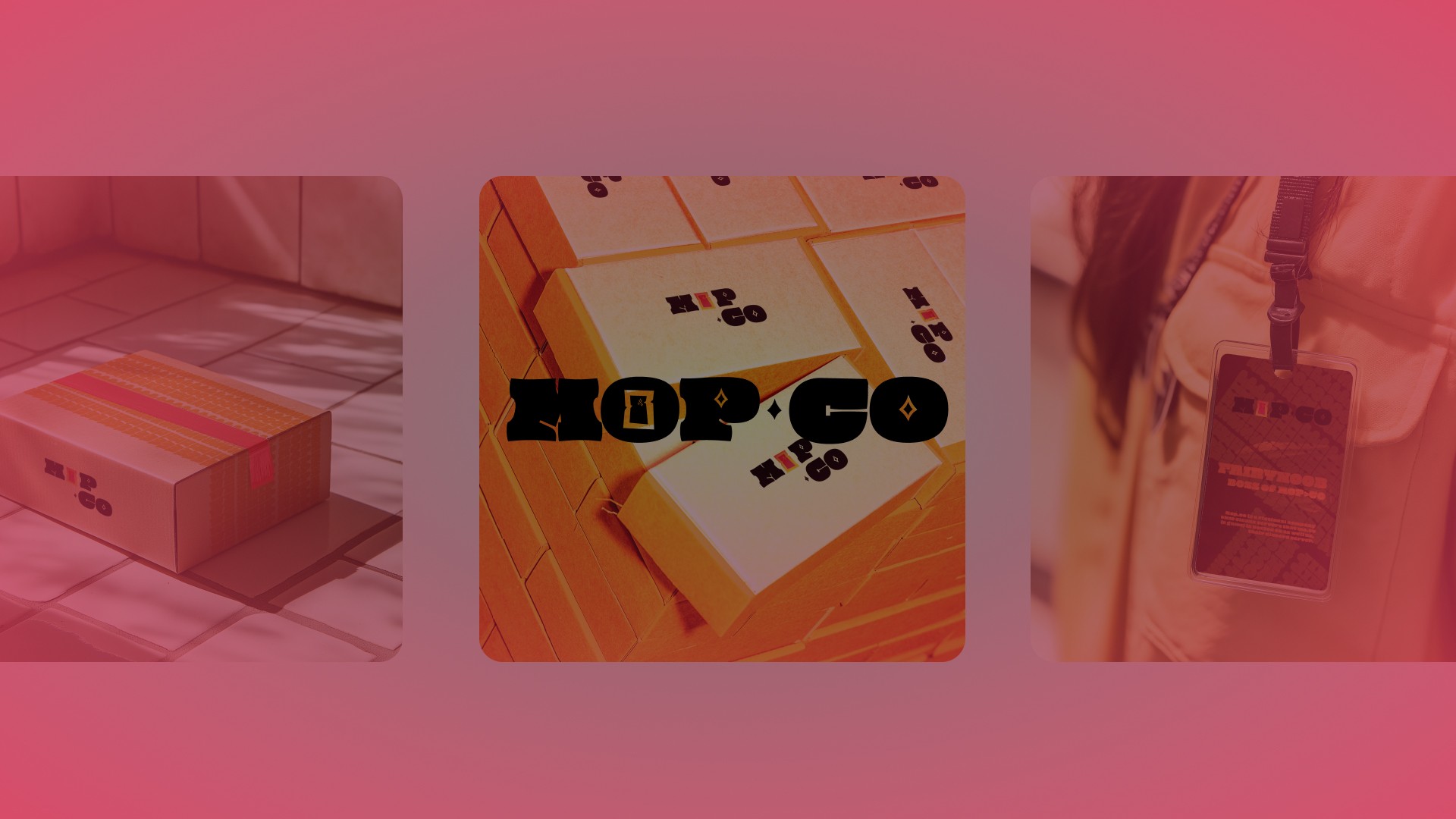
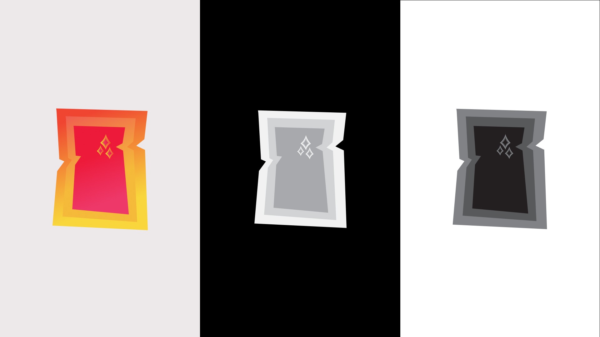
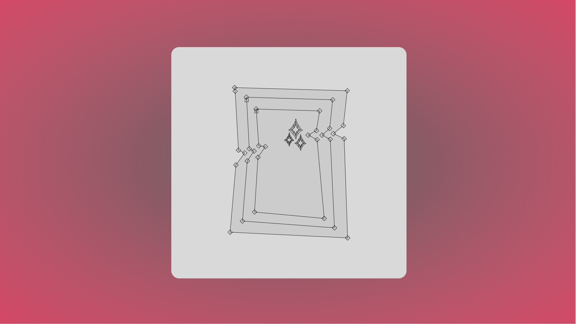
[Primary And Secondary Lockup (2nd variant)]
This logo had to resemble the old mo.co logo (when the game was in beta), while still having its own touch to represent the cleanliness, and stability to the portal. The stars represent the cleanliness as Mop.co improves the gaming space which makes the it fair and clean, and 3 parts of the portals represent the collaboration within this company.
[Mockup]
[Mockup]
[Mockup]
[Mockup]
[Mockup]
[Mockup]
This Case Study is not yet published. It is going to be completed by the end of April! See you then!
Testimonial
Radams execution of the "mo.co" logo demonstrates thoughtful attention to detail. After discussion over the theme, Radam was able to successfully capture the themes of strength and rigidity in the overall design. The design was further enhanced by the re-invention of the "portal" theme as a more traditional doorway. The design encompasses the desire for a strong and unwaivering feel while still maintaining the fun and whimsy of "mo.co".
