Pictures are soon to be added!
Why rebrand?
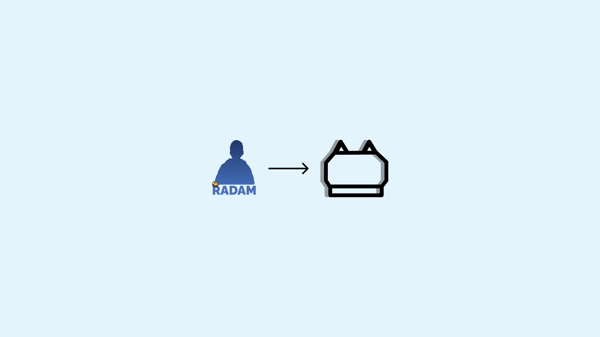
Personal logo rebrand marks the beginning of my brand design career, a project I started in early January. The design draws inspiration from the silhouette of my mascot and the playful doodles my younger brother loves to sketch everywhere, adding a personal and nostalgic touch to the identity.
Struggles
Just, like with every project there were some struggles. The main struggles with this project were changing the font and actually making the logo feel right. I had 2 choices with the font; make one of my own and download or buy one from somewhere. I picked downloading it from somewhere. And, making the logo feel right also was a struggle, because it was either too small, too big or didn't look like what I wanted it to look.
So, let's dive into the actual process!
Problems with the old logo
Old logo was designed in 2018, 7 years ago and the trends changed massively since. The gradients aren't used as much right now, and they are a pain for different kinds of content and things you need to put them on. Having gradients on logos is a nightmare, it doesn't always work on different background colors and you can't really make inverted variants of them. Also, the old logo was a shape drawn on top of my photo, so it looked like a blob on avatars and in small scale. So that's why I decided to rebrand!
[Image | Soon to be added]
Old and Hard Design System
The old design system was super old having objects with different styles, and it was really hard to use and keep track off, some assets weren't vectorized, so I had to update my whole design system. The hardest part of it was vectorizing my mascot, because it was originally made in GIMP and saved in .png files. So I had to redraw it with squares in Figma. Then, I updated all my design system, in some assets I kept, some I removed or updated to match my new style!
[Image | Soon to be added]
Creating the new logo
The initial idea for the new logo came from the silouhete and little drawings my younger brother would draw on literally everything. It needed some tweaking, adding shades, change the width and height, etc.. And after a few weeks of doing that, I decided on the one I am using right now. Then was the time to change the font and look at the sign.
Let's look at that:
Changing the font
Trends change, so as the fonts. It was time to change the font I used since 2018. It was hard, because I couldn't the font that matched the new brand right! And then I thought, I should make my own. But the process of making your own font is a nightmare, you have to have every character look nice, cyrylic and latin. So I continued looking for the font that would this day's trends and my new style. And, after countless choices and hours of searching I picked this one:
[Image | Soon to be added]
Playing with the wordmark
The Wordmark… The thing that tells customers the name of your brand. In some cases your whole logo. In my case, it's not gonna be used so frequently, but sometimes it will be the only brand mark that is going to be used. I wanted to either create something new or refresh the old one. I chose to refresh my old wordmark, change the size of the mascot on the right-bottom side, and maybe change the font. In order to change the size of the mascot, I had to vectorize it, a hard and time-taking process, especially when I have a bunch of different emotes.
I wanted to make my mascot look smaller on right-bottom side of the wordmark to signify that it is just a small part of me and my design system, focusing on learning and applying new skills. And then, a new problem appeared, for some reason SVG's appeared to have spaces between squares that made the pixel mascot… For apparently no reason, at least I couldn't find the problem. See the next section to know how I fixed it!
[Image | Soon to be added]
SVG Problems (I HATE IT!!)
As I just said, I had problems with the SVG file of my mascot appearing with gaps, after importing it into Adobe Illustrator, from Figma, where I vectorized my pixel-art mascot. The SVG looks fine when watching in in a browsers and in Illustrator before exporting it. So, what's the problem, you may ask? Figma doesn't export .svg's with shape-rendering="crispEdges" which makes the browser not to round the corners or anti-aliasing. So, everything that I had to do is add that parameter in .svg code.
Before:
After:
[Image | Soon to be added]
The Lockup Alignment
The logo emblem and wordmark should always be aligned properly! But with my logo just making the logo and wordmark have the same height didn't look quite right. Having the symbol on the right side also didn't look right. So, I put the emblem on the left. But, making the wordmark and emblem the right size for it to look good.
And this is how it looks:
[Image | Soon to be added]
Color Palette
Just, like every brand, I needed a color palette. Color Palette is a collection of different colors that a brand will use for their advertisements, brand assets and everything else associated with a brand. I wanted some light-weight, pastel colors, something exactly opposite of what I had before.

Portfolio Website
After finishing all of the brand and design system work, I started working on my portfolio website, the one you are reading it on right now. At first it went great, really great. I had to change a few things that I originally wanted to add. I had to change how the project banners looked, and the look of navbar (buttons).
Then, I had to upload .svg lockup for the footer, it didn't scale properly, it looked pixelated for some reason. I then tried exporting it again with other settings for the .svg export in Illustrator, but it didn't work out. So, after lots of time playing with it I fixed it (kinda). Then the logo in the header started changing color to pink after uploading .svg and then couldn't be fixed. Re-uploading the logo didn't help. And I just left it as is for the night. The next morning I tried fixing, and the fix was kind of simple, and weird. I had to go into preview and change the page's size. And then it fixed, somehow!
Here is how it looked at first and at the finish:
[Image | Two versions of the website on mockups]
Social Media Posts
Just, as every brand needs to post things on social media, I need to post on Instagram, Facebook, LinkedIn, etc. and I need some kind of template for the posts, for good brand recognition . So, I had to create a few of them, having different colors for different occasions, like something really important or urgent, and just regular posts.
[Image | Soon to be added]
Sub-Brands
I have a lot of Instagram pages, brands I started, some are frozen, some are not. But, I needed a logo for each one of them. So. after a lot of ideas, I decided to make 5 different color variants of my logo for the sub-brands. In, future I may take the original logo, and customize in some way to look different in black, but it's for future. They are going to be mainly used on Social Media.
[Image | Soon to be added]
Final Message
I have been so excited to launch my redesign and a brand design business, and I finally did it. I've been so fortunate to have, family members, friends, and other people that supported me through this process.
Love, y'all! <3
Pictures are soon to be added and the text revised. This case study is not yet done. WORK IN PROGRESS! It is going to be done by the end of April
Testimonial
Radams execution of the "mo.co" logo demonstrates thoughtful attention to detail. After discussion over the theme, Radam was able to successfully capture the themes of strength and rigidity in the overall design. The design was further enhanced by the re-invention of the "portal" theme as a more traditional doorway. The design encompasses the desire for a strong and unwaivering feel while still maintaining the fun and whimsy of "mo.co".
